주의! Caution!
해당 게시글은 Archive된 게시글 입니다.
Archive된 사유는 다음 중 하나에 해당 됩니다.
Archive된 사유는 다음 중 하나에 해당 됩니다.
- 작성 된지 너무 오랜 시간이 경과 하여, API가 변경 되었을 가능성이 높은 경우
- 주인장의 Data Engineering으로의 변경으로 질문의 답변이 어려워진 경우
- 글의 퀄리티가 좋지 않아 글을 다시 작성 할 필요가 있을 경우
이번 시간에는 Python 시각화 라이브러리인 matplotlib을 이용해, 간단하게 데이터를 시각화 하는 예제 코드를 알아보는 시간을 가져 보겠습니다.
해당 포스트는 ratsgo님의 게시글를 참고하여, 데이터 및 주석 등을 재구성한 포스트임을 알립니다.
가장 먼저
numpy와 matplotlib.pyplot을 import 합니다.
import numpy as np
import matplotlib.pyplot as plt
꺾은 선 그래프
years = [2015, 2016, 2017, 2018, 2019]
rank = [5, 3, 2, 3, 4]
plt.plot(
    years,  # x축 데이터
    rank,  # y축 데이터
    color='blue',  # 선 색깔
    marker='o',  # 꼭짓점 설정
    linestyle='solid'  # 선 스타일 설정
)
plt.xlim(2014.5, 2019.5)  # x 범위 설정 (start, end)
plt.ylim(6, 1)  # y 범위 설정 (start, end)
plt.title("Tottenham Hotspur's EPL Rankings 2015-2019")  # title 설정
plt.xlabel('year')  # x축 레이블 설정
plt.ylabel('rank')  # y축 레이블 설정
plt.show()
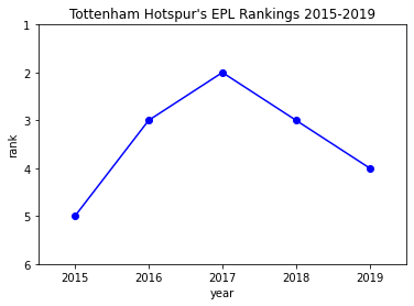
근데 얘네 이번 시즌은 왜 그러는 걸까요.
막대 그래프
scorers = ['Kane', 'Son', 'Moura', 'Llorente', 'Alli', 'Eriksen']
number_of_goals = [20, 20, 9, 7, 7, 7]

xs = [i for i, _ in enumerate(scorers)]
plt.bar(xs, number_of_goals)  # 해당 인덱스에 일치하는 값을 가진, 바 형태 그래프 생성
plt.xlabel("Scorers")
plt.ylabel("Goals")
plt.xticks([i for i, _ in enumerate(scorers)], scorers)  # x 눈금 및 레이블 설정
plt.title("Tottenham Hotspur's Top Scorers in 2018-2019")
plt.ylim(0, 25)  # y 범위 설정 (start, end)

for index, value in enumerate(number_of_goals):
  plt.text(index - 0.1, value + 0.5, str(value))  # x 좌표, y 좌표, text
plt.show()
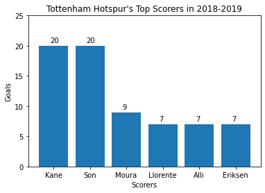
이럴 꺼면 요렌테, 에릭센을 왜 판 걸까요.
히스토그램
from collections import Counter
signs = [55, 42, 29, 27, 27, 26, 25, 25, 24]
histogram = Counter(sign // 10 * 10 for sign in signs)
plt.bar([x for x in histogram.keys()], histogram.values(), 8)  # 인덱스, 값, 바의 너비
plt.axis([15, 55, 0, 10])  # X: 15 ~ 65, Y: 0 ~ 5
plt.xticks([10 * i for i in range(2, 6)])  # x 눈금 설정
plt.xlabel("per £m")
plt.ylabel("Player")
plt.title("Tottenham Hotspurs's Most Expensive Signs")
plt.show()
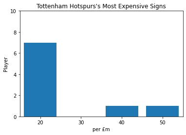
저 50에 혼자 있는게 은돔벨레 녀석입니다.
선 그래프
dele = [7.35, 7.35, 7.09, 6.95, 6.89]
eriksen = [7.45, 7.53, 7.4, 7.08, 6.51]
son = [6.53, 7.14, 6.99, 7.1, 7.23]
kane = [7.53, 7.68, 7.6, 7.38, 7.2]
xs = [2015, 2016, 2017, 2018, 2019]

plt.plot(xs, dele, 'r-', label='Dele Alli')  # x, y, 선 색깔 및 타입 (r: 빨강, -: 실선)
plt.plot(xs, eriksen, 'g--', label='Christian Eriksen')  # (g: 초록, --: 파선)
plt.plot(xs, son, 'b-.', label='Heung-Min Son')  # (b: 파랑 -.: 1점 쇄선)
plt.plot(xs, kane, 'k:', label='Harry Kane')  # (k: 검정, -: 점선)
plt.xlim(2014.5, 2019.5)  # x 범위 설정 (start, end)
plt.ylim(6, 8)  # y 범위 설정 (start, end)
plt.legend(loc=8)  # loc=8로 하단 중앙에 범례 설정
plt.xlabel("Year")
plt.ylabel("Rating")
plt.title("DESK's Annual rating")
plt.show()
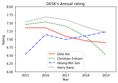
에릭센 어디 갔어
산점도
goals = [13, 9, 8, 4, 3]
assists = [2, 9, 4, 2, 0]
players = ["Kane", "Son", "Alli", "Moura", "Bergwijn"]
plt.scatter(goals, assists)  # x 좌표, y 좌표 에 일치하는 점을 찍음

for goal, assist, player in zip(goals, assists, players):
  plt.annotate(player,  # 텍스트
               xy=(goal, assist),  # x 좌표, y 좌표
               xytext=(5, -5),  # x 좌표, y 좌표 이격
               textcoords="offset points")  # 좌표 point 기준으로 설정함)
plt.title("Tottenham Players Goal and Assists")
plt.xlim(0, 15)
plt.xlabel("Goals")
plt.ylabel("Assists")
plt.show()
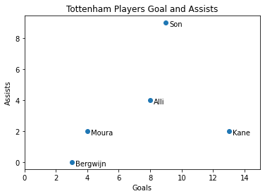
공격 포인트 가뭄이군요.
히트맵
x = [2015, 2016, 2017, 2018, 2019]
y = ["Kane", "Son", "Dele", "Eriksen", "Moura"]
arr = np.array([
  [26, 36, 32, 21, 15],
  [5, 20, 18, 18, 18],
  [19, 25, 19, 8, 12],
  [19, 23, 20, 20, 4],
  [13, 17, 3, 10, 6]
])
plt.xticks([i for i, _ in enumerate(scorers)], x)
plt.yticks([i for i, _ in enumerate(scorers)], y)
plt.xlabel("Year")
plt.ylabel("Player")
plt.title("Tottenham player's Goal + Assist")
plt.imshow(arr)  # image와 유사한 데이터 표시
plt.colorbar()  # 우측 컬러바 설정
plt.show()
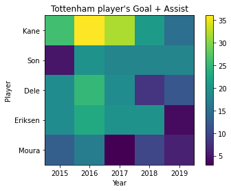
토트넘도 다시 행복 축구를 할 수 있을까요..?
마치며
지금까지 matplotlib을 이용한 데이터 시각화 예시 코드를 알아보았습니다. 가장 중요한 것은 예제 코드를 이해하는 것 뿐만 아니라. matplotlib 공식 Document 또한 확인하면서, 각 함수의 용도가 무엇인지, 어떤 파라미터가 필요한지 알아내는 것 또한 중요 합니다.
Recent Posts in Data-Science Category